Turn The Tables Series - Question 11

QUESTION 11
Your favorite color to design with or use. Any particular reason you are drawn to that color? If you have examples of your work with it or inspiration, please share link(s) with us.

"I do a lot of exclusives with lines I carry and there is always a form of green in there. I also have green in my branding (bags, stickers for the bags, logo, business cards, etc…) Green is part of my brand. I have some fun items coming up for Christmas that are also in the green color ways that I’m excited about.
http://ameliapresents.com/products/exclusive-leather-keychains-for-amelia-from-son-of-a-sailor
http://ameliapresents.com/collections/room/products/mint-coffee-mug
http://ameliapresents.com/collections/accessories/products/maptotes
" -Erin
CONNECT WITH ERIN: website | instagram | facebook | twitter | pinterest

"I seem to be really attracted to the color gray. From the beginning our first greeting card series was always a single color plus gray. And now I am determined to use gray paper. I love that it's a neutral, but still a color at the same time, and it isn't black. Black is so stark (you won't find it anywhere in our collection), just in my closet." -Meg
CONNECT WITH MEG: website | instagram | facebook | twitter | pinterest

"Ummmm sequins ... for obvious reasons :) (sequins aren't just one color but hey)" -Aubrie
CONNECT WITH AUBRIE: website | instagram | facebook | twitter | aubrie's instagram
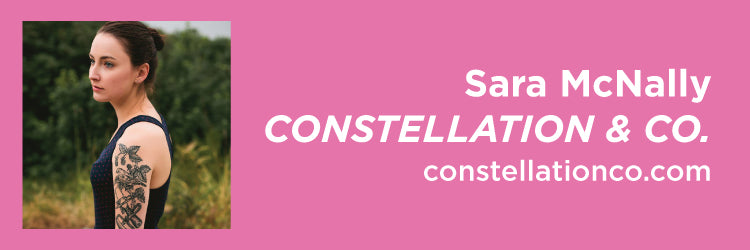
"I love color, but when I'm designing I always gravitate to black ink. I love crisp black ink on nice paper. I love the contrast and the simplicity. It's classic, like the pages of a good book. It's traditional to letterpress, and it will never go out of style! A few links - Journey, You & Me, Will You, Bear With Me" -Sara
CONNECT WITH SARA:
website | instagram | facebook | twitter | pinterest

"I've been using a very particular gold ochre fabric in my shop for years. It's a beautiful tone that's really hard to describe... sort of a bright olive oil gold, but with more depth... It's my absolute favorite, and I never get tired of using it in my home. It's also one of the only warm tones that I'm consistently drawn to -- otherwise I'm obsessed with blues." -Erin
CONNECT WITH ERIN: website | instagram | facebook | twitter | pinterest

"URG you’re asking me to pick a favorite child! (If I had any of those…) I’ve always been drawn to turquoise and teal. Paired with red or orange, that’s my fave color combo. Even though it’s such a hip color right now, the attraction to mint is really just the next obvious move when you operate within the blue-green color family." -Kristina
CONNECT WITH KRISTINA: website | instagram | facebook | twitter | pinterest

"Navy. White. Gold Foil. Don’t make me pick! I love classic colors." -Emily
CONNECT WITH EMILY: website | instagram | facebook | twitter | pinterest

"My favorite color is a seafoam green / blue. I freaking love that color. It can be calming or exciting, friendly and just plain pretty if paired with the right color combo. I love the color so much my notebook, phone case and bathroom are that color." - Lisa
CONNECT WITH LISA: website | instagram | facebook | twitter | pinterest

"I love color! I can’t choose a favorite! I mean, if I have to I guess peachy salmon and seafoam green will always have a special place in my heart." -Rosanna
CONNECT WITH ROSANNA: website | instagram | facebook

"Fluorescent red, pms 805! Because it pops, man, it pops! We designed our wedding invitations with that color and it became a viral hit. 5 years later we still get people calling about those invites!" -Arley-Rose
CONNECT WITH ARLEY-ROSE: website | instagram | facebook | twitter | pinterest

"Greige, man. It goes with literally everything. And cobalt blue, white and gold foil/tarnished brass colors are my new obsession. You'll be seeing a lot of that soon from Lucky Luxe." -Erin
CONNECT WITH ERIN: website | lucky-luxe instagram | facebook | erin's instagram | pinterest

"Navy of course is the source of all our color inspiration around here. If a color pairs nicely with navy (which most do), chances are we are using it everywhere. Personally I am drawn most to pink so a lot of packages products or things I design to go inside packages have pink on them. It's such a happy color!" -Jordan
CONNECT WITH JORDAN: website | instagram | facebook | twitter | pinterest

"I’m an 80’s baby and I love bold gold." -Jillian
CONNECT WITH JILLIAN: website | instagram | facebook | twitter | pinterest

"Mustard Yellow (not French's) for years now. Sort of an odd choice I feel but I am always drawn to it. I think because it looks so rich but so vintage and fun at the same time." - Dana
CONNECT WITH DANA: website | instagram | facebook | twitter | pinterest

"PINK & my very existence, IG and website tell you so!" -Tiffany
CONNECT WITH TIFFANY: website | instagram | facebook | twitter | pinterest

"PMS 647U. It’s the blue we use for the Business Camp branding and materials. I love blue, its been my favorite color since I was a kid and I’ve always been drawn to cool colors. Maybe its because I love the water?" -Katie
CONNECT WITH KATIE: website | instagram | facebook | twitter | pinterest

"I personally don’t do design work but I love small type and lots of white space; simple & clean. http://www.sycamorestreetpress.com/collections/art-prints/products/stop-a-moment-cease-your-work-and-look-around-you-letterpress-art-print" -Susan
CONNECT WITH SUSAN: website | instagram | facebook | pinterest

"Although I claim to not be a pink person, you would never know it by looking at Moon and Lola, because we are so pink! I love white and how a splash of color looks with mostly white, but there is just something about pink! It makes people happy! " -Kelly
CONNECT WITH KELLY: website | kelly's instagram | brand instagram | facebook | twitter | pinterest

"Bright pink! It's ALL over Oh So Beautiful Paper! I like just about any shade of pink, from the lightest portrait pink to deep raspberry and magenta. I'm convinced pink is a neutral because it goes with just about everything." -Nole
CONNECT WITH NOLE: website | instagram | facebook | twitter | pinterest
Thanks again friends for following along on our new series and I truly hope you enjoyed it! Catch question 12, next Wednesday!


Leave a comment